
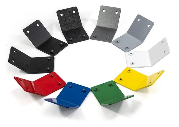
"RAL 7016 anthracite grey, satin, smooth" is a complete powder coating colour spec. A RAL code pins down the colour, the gloss level says how shiny it is, and the texture says whether it's smooth or rough to the touch. Leave out either of the last two and you can get the right colour that still looks wrong.
Two parts in the same RAL shade can look different if one is gloss and the other matt, and your phone screen never quite matches what comes out of the oven. Below we explain how RAL codes work, how gloss and texture change the look, which colours people choose most, and how to match something you already have.
How RAL codes work
RAL is a European colour standard that's been in use since 1927, and it's the most common way to specify powder coating colours. The range most coaters work from is RAL Classic, which currently has 216 colours. Each has a four-digit code and a name.
The first digit tells you the colour family:
- 1xxx yellows and beiges
- 2xxx oranges
- 3xxx reds
- 4xxx violets
- 5xxx blues
- 6xxx greens
- 7xxx greys
- 8xxx browns
- 9xxx whites and blacks
So RAL 9005 is jet black, RAL 9010 is pure white, and RAL 7016 is anthracite grey. Always give the code. Names like "charcoal" or "off-white" mean different things to different people, and several RAL whites look alike until they're side by side.
Gloss level changes how a colour looks
Gloss is how much light the surface reflects. It's measured with a gloss meter at a 60° angle and reported in gloss units. A common way to group powder finishes, used in the QUALICOAT architectural specification, looks like this:
| Finish | Gloss at 60° | Looks like | Good for |
|---|---|---|---|
| Matt | 0–30 GU | Flat, low reflection | Architectural work, hiding small marks and dents |
| Satin (semi-gloss) | 31–70 GU | Soft sheen | General-purpose: gates, enclosures, furniture |
| Gloss | 71–100 GU | Shiny, reflective | Easy-clean surfaces, bright colours, signage |
Gloss changes how you perceive colour. The same pigment usually looks darker and richer in gloss than in matt. If you're matching an existing part, match the gloss as well as the code.
There's also a practical side. Gloss shows every ripple, weld mark, and grinding scratch in the metal underneath. Matt and textured finishes hide them. On a large flat panel, or a welded frame that hasn't been ground perfectly smooth, satin or matt is the forgiving choice.
Smooth, textured, and special finishes
Texture is separate from gloss.
- Smooth is the default and the easiest to clean.
- Fine texture has a slightly sandy feel. It hides minor surface marks and fingerprints and is popular on enclosures and machine covers.
- Coarse texture or wrinkle finishes have a pronounced pattern and hide a lot, but they trap dirt and are harder to touch up invisibly.
- Metallic and special-effect powders include flakes or particles for a metallic sheen. They look great but vary between manufacturers, can show patchiness across large panels, and some need a clear topcoat to protect the effect outdoors. Ask before committing.
Not every RAL colour is available in every gloss and texture from every powder manufacturer, so name your preferred finish and ask what's possible.
The colours people pick most
There's no secret right answer, but a few colours come up again and again on sheet metal and steelwork:
- RAL 9005 jet black: gates, balustrades, signage, furniture frames. Shows dust but looks sharp.
- RAL 7016 anthracite grey: the default modern architectural grey. Pairs well with aluminium window frames.
- RAL 9010 pure white and RAL 9016 traffic white: kitchen and shopfitting parts, light fittings, interior enclosures.
- RAL 7035 light grey: a common colour for electrical enclosures and switchgear.
- Safety colours such as yellows and reds for guards and machinery, where a standard or a client spec may dictate the shade.
For outdoor parts, darker colours absorb more heat in the sun, and some strong, bright colours can fade sooner than neutrals. Use a polyester powder outdoors; epoxy powders chalk and fade in sunlight whatever the colour.
Matching an existing colour
Screen colours lie. Your monitor, phone, and printer all show RAL colours slightly differently, and online swatches are approximations. Pantone and RAL are separate systems with no official one-to-one conversion either.
For anything that has to match, use something physical:
- The RAL code from the original spec, if you can find it. Check old drawings, invoices, or a sticker on the part.
- A physical RAL fan deck or swatch, viewed in daylight next to the item you're matching.
- A sample part, or a photo taken in daylight with a known white or grey card in the frame, if there's no code.
Even with the right code, powders from different manufacturers, or different production batches, can vary slightly. If parts must sit side by side, coat them in the same batch. If you're adding to an existing installation, accept that a close match is the realistic goal, or coat the whole visible set again.
Designing with colour in mind
A few small decisions make colour easier to get right:
- Coat signs and lettering in one colour per part where possible. Two-tone designs mean extra masking. Our guide to laser-cut metal signs covers design and finishing for signage.
- Mark no-coat areas clearly, so earth points and threads don't end up in your chosen colour. See masking for powder coating.
- Group parts by colour on an order. One colour across all parts is simpler than five colours across five parts.
If you're new to powder, what is powder coating explains how the process works and why the coat is thicker than paint.
Telling us your colour
You can give us your colour by RAL code, by name, or with a photo of what you want to match. We confirm the colour with you before coating, so there are no surprises when the parts come out of the oven. Add the gloss level and texture if you know them.
Our powder coating service covers parts we make and parts you send in. Start a powder coating quote with the colour, quantity, and any masking marked on your drawing.